
Women from History: Marianne Brandt
By Julia Ritson She made dustpans, clocks, lamps, and light shades and was to become one of the great success stories of the Bauhaus, the German school of design founded in 1919.

Marianne Brandt was first a student then a teacher of metal work at the Bauhaus. Traditionally, Bauhaus women were popped into the textiles department and Brandt had to work hard to be accepted into the metal workshop.
At the time, the master of materials and form, László Moholy-Nagy, was in charge of the metal workshop.
When Brandt first arrived, fancy table top items were the focus of the workshop. These concise silver and bronze pieces were made in 1924. Articles for every day use.

Brandt was the only female student and wasn't immediately welcomed into the male group.
At first I was not accepted with pleasure - there was no place for a woman in a metal workshop, they felt. They admitted this to me later on and meanwhile expressed their displeasure by giving me all sorts of dull, dreary work. Later things settled down, and we all got along well together.
In the late 1920's there was a strategy of trying to integrate art and technology. They were attempting to make art objects for a mass market.
At one point the school needed decent lighting solutions to fit the new design aesthetic and the brief was given to the Metal team to come up with solutions. Here are the adjustable lamps hanging in the weaving workshop, designed by Marianne Brandt and Hans Przyrembel in 1927.

The idea of making lighting fixtures out of shallow glass dishes attached directly to the ceiling probably came about in the metal workshops of the Bauhaus. Also the the idea of combining opaque and frosted glass, of making lighting fixtures of aluminium and of designing ceiling fixtures with glass cylinders appears to have first been thought of in the Bauhaus.
This glass globe was designed in 1926 and manufactured by a firm in Berlin. Good modern industrial design.

The much imitated "Kandem" bedside-table lamp was designed by Brandt in 1927. It was then produced by Körting & Matthiesen in Leipzig. From 1928 to 1932 this company often sought advice from the Bauhaus for its designs of light fixtures and desk lamps. During these years more than fifty thousand Bauhaus designed lamps were sold.

You can buy one today on ebay for US$2,750.
Julia Ritson is a Melbourne artist. Her paintings investigate colour, abstraction and a long-standing fascination with the grid. Julia has enriched and extended her studio practice with a series of limited edition art scarves. She also produces an online journal.
Women from History: May Morris
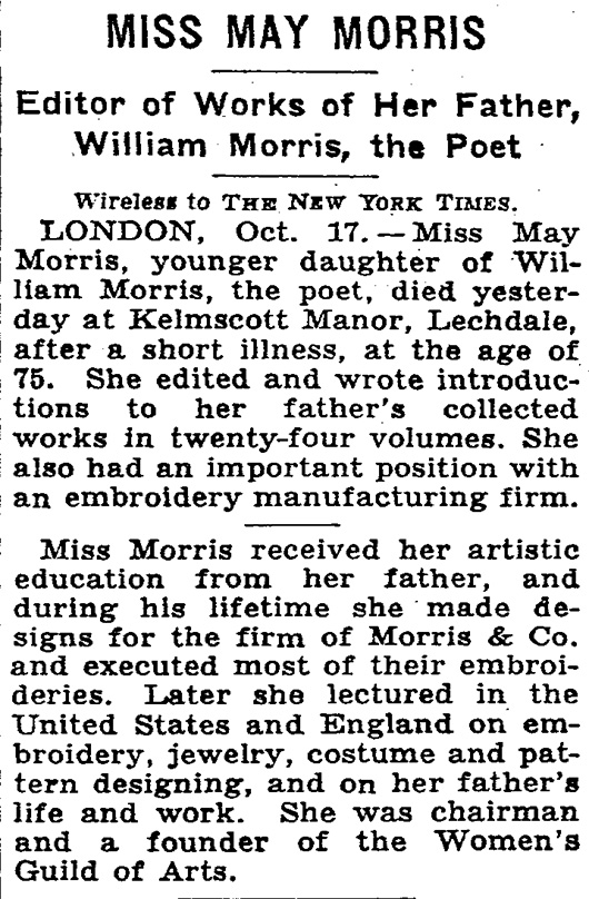
By Julia Ritson May Morris was an embroiderer, jeweller and editor who lived her life overshadowed by her famous father - the arts and craft doyen William Morris.
The Morris family were craft makers who extolled the virtues of a pre-mechanised world. They were living in a world where the word Master had come to mean Master of others, rather than Master of a craft. They preferred the mastery of craft concept.
The Arts and Crafts movement they were part of looked back to the medieval world with a focus on textiles, wood, metal work, and interior design. Plus a little medieval poetry thrown in.
The family business sold medievally themed items to the emerging English middles classes in the late 19th century.
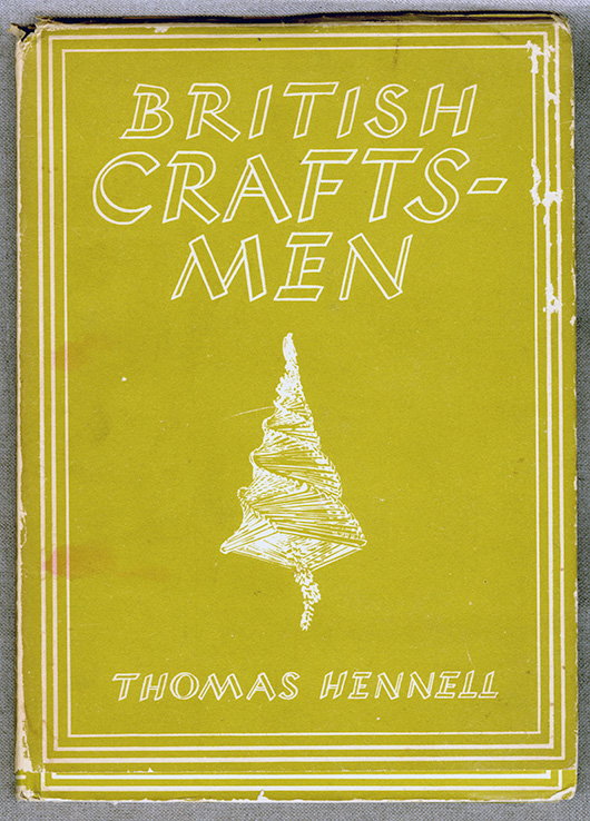
I first came across the work of May Morris in this British Craftsmen book written in the 1940s.
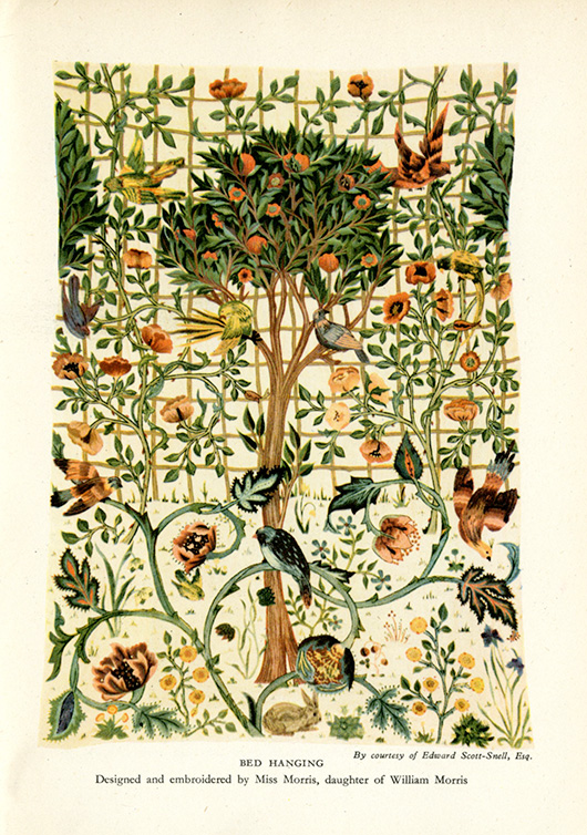
May Morris' work was featured.
The William Morris company resurrected the concept of free-form embroidery. The idea of "Art needlework" highlighted freehand stitching and shading in silk threads to achieve a more expressive result, rather than the formulaic templates of the typical embroidery of the mid-19th century.
May Morris trained at the South Kensington School of Design and at the age of 23 took over the management of the embroidery section of Morris & Co from her father. A very capable young lady.

May Morris went on to write a wonderful book called "Decorative Needlework."
"Chain-stitch has been so called because it imitates, more or less, the links of a simple chain. It is the foremost and most familiar of all similar stitches. It has a very definite character of its own, and though apt to become a little monotonous, is from its laborious and enduring- nature well suited to work that may be subjected to much wear and tear. In the accompanying diagram it will be seen that each little loop grows out of the last; the needle follows the exact direction in which the line of stitches is to lie."

May's insights on colour are worth sharing.
"Of blue choose those shades that have the pure, slightly grey, tone of indigo dye (varying somewhat, of course, on different materials). The quality of this colour is singularly beautiful, and not easy to describe except by negatives : it is neither slatey, nor too hot, nor too cold, nor does it lean to that unutterably coarse green-blue, libellously called ' peacock ' blue ; it has different tones - brilliant sometimes, and sometimes quiet - reminding one now of the grey-blue of a distant landscape, and now of the intense blue of a midday summer sky - if anything can resemble that.
Of reds, we have first a pure central red, between crimson and scarlet (for in the pure colour neither blue nor yellow should predominate), but this is a difficult shade to use; by far the most useful are those 'impure' shades which are modified by yellow, as, for instance, flesh-pink, salmon, orange, and scarlet; or by blue, as rose-pink, blood-red, and deep purple-red. The more delicate of such shades can be freely used where a central red, overpowering in its intensity, cannot. A warning, however, against abuse of warm orange and scarlet, which colours are the more valuable the more sparingly employed, and as dainty little spots of colour treasures indeed.
The most valuable colour next to blue is green, or, rather, equally valuable in its different way, being to some people more restful to the eye and brain.
Here, again, we see the force of the positive and relative value of colours : a cold, strong green, not in itself very pleasing, placed against a clear brilliant yellow, gathers depth and force which it would otherwise lack ; a blue-green may strike the right note in a certain place, but if its use be exaggerated may blemish all. Now, there are certain greens which are brilliant and rich, and, when employed broken with other colours, produce a fine effect; but when a green is to be largely used, it should be chosen of a greyer, soberer shade, such as the eye rests on without fatigue. Avoid like poison the yellowish-brown green of a sickly hue that professes to be ' artistic,' and looks like nothing but corruption, and avoid also a hard metallic green, which, after all, would not easily seduce a novice, as it is very obtrusive in its unloveliness.
Certain definite sets of green will be necessary ; full, pure yellow-green, greyish-green, and blue-green, two or three shades of each. The brilliant pure green that we admire in a single spring leaf is impossible to use in large masses, nor does Nature, whose all-pervading colour is green, give us these acute notes in unbroken mass. You have only to look at the effect of light and shade in a tree in full spring foliage, with the browns and greys of its twigs, to realise this fact: the great masses of green meadow-land, besides showing a variety of colour that may be overlooked in a careless glance, have a tenderness of tone that is quite beyond and above any possible imitation in art.
For a central yellow choose a clear, full colour that is neither sickly and greenish, nor inclined to red and hot in tone. Of impure yellows, pale orange and a warm pinkish shade that inclines to copper are useful, besides the buff and brownish shades that will sometimes be wanted for special purposes. These, I think, include all the yellow shades that you need trouble about. A certain experience is wanted for the successful use of yellow, so that those who take a special delight in the intrinsic beauty of this fine colour will do well to avoid too enthusiastic an introduction of it into their work.
Purple again is one of the 'difficult' colours with which we must, as it were, hit upon the exactly right tones to use. There are two valuable purples - a rather full red-purple, tending to russet, and a dusky grey-purple, which is, if the right tone is obtained, a very beautiful, and, if I may say so, poetic colour."
A poetic lady.
Julia Ritson is a Melbourne artist. Her paintings investigate colour, abstraction and a long-standing fascination with the grid. Julia has enriched and extended her studio practice with a series of limited edition art scarves. She also produces an online journal.
Women from History: Swank Elsie de Wolfe
The young artist, Cecil Beaton, met and sketched interior decorator Elsie de Wolfe in New York in 1929. He was much younger than her but he liked her at once calling de Wolfe "the sort of wildly grotesque artificial creature I adore".
Elsie de Wolfe had middling success as a stage actor.
Her real success came after she changed direction and became an important American tastemaker. A lady decorator.
One of her most famous interiors was for the first female only club in New York, the Colony Club.
This is the Trellis Room.

And the Strangers' Room

In 1915 she published The House in Good Taste. A natty book on all things refined in the home. But also a treatise on the idea of women's spaces. A space made by women after the men have played their architectural part.
"It is the personality of the mistress that the home expresses. Men are forever guests in our homes, no matter how much happiness they may find there."
De Wolf also had some particular ideas on colour.
"If you are inclined to a hasty temper, for instance, you should not live in a room in which the prevailing note is red. On the other hand, a timid, delicate nature could often gain courage and poise by living in surroundings of rich red tones."
In 1938 Janet Flanner wrote a story about de Wolf in The New Yorker.
"She was a wizard saleswoman. She made money because she likes money and is vulnerable to it, because she has a true, talented eye for color, because she loved the job, and above all because the time was ripe for the work. Women clients liked her because she planned plenty of closets and was practically the mother of modern lampshades; also, she had an inventive efficiency unafraid to mix the practical and lovely.
"She is today a lively little figure with artfully coiffed pale green hair, squirrel-brown eyes, an alert, inquiring, small chic face, and neat tiny feet in low-heeled shoes. She has an air of being an eccentric, entertaining, highly compact, energetic personality. She has been called one of the world's best-dressed women and probably is, since she sensibly gets beautiful Parisian clothes which are simple, fit perfectly, aren't ephemeral or startling in style, and which she generally wears two or three years. She wears chiefly blue or black, and used to adore beige. When she first looked at the Parthenon in Athens, she cried, 'It's beige—just my color!'"
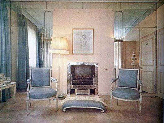
This elegant sitting room from the thirties represents the work of de Wolfe's glamourous lady rooms. Gleaming mirrors, pale walls and painted furniture with soft blue fabrics.
And by the way she was a fitness freak.

And, this is the best bit, at her home in France, the Villa Trianon, she had a dog cemetery in which each tombstone read, "The one I loved the best."
A swanky creature.
Julia Ritson is a Melbourne artist. Her paintings investigate colour, abstraction and a long-standing fascination with the grid. Julia has enriched and extended her studio practice with a series of limited edition art scarves. She also produces an online journal dedicated to art and scarves and architecture.
Women from History: Best Modern Sydney
Marion Hall Best (nee Burkitt) attended Thea Proctor’s art and design classes in Sydney. Another country girl. Along with her painter sister Dora Sweetapple. Marion studied architecture for a year and became intrigued with the ideas of Harry Seidler and Buckminster Fuller. This was a time when women were seen merely as decorators. Marion always thought of herself as a designer.
She became very good at bouncing walls apart. She set up shop in Queen Street Woollahra as Sydney's first interior designer and became an expert in all things modern.

From 1951, Best worked as a founding member of the Society of Interior Designers of Australia (SIDA) to encourage public recognition of designers and to improve professional standards.
Best became known for her exhibition rooms, or 'personality' rooms. In these room she was able to express her new ideas untroubled by pesky clients or market demands.
In this case, a 'Room for Peter Sculthorpe.' The vivid green glazes showcase a Jack Meyer's musical sculpture, Magistretti table, Tobia Scarpa leather seats, and Architectural Fibreglass indoor/outdoor furniture.
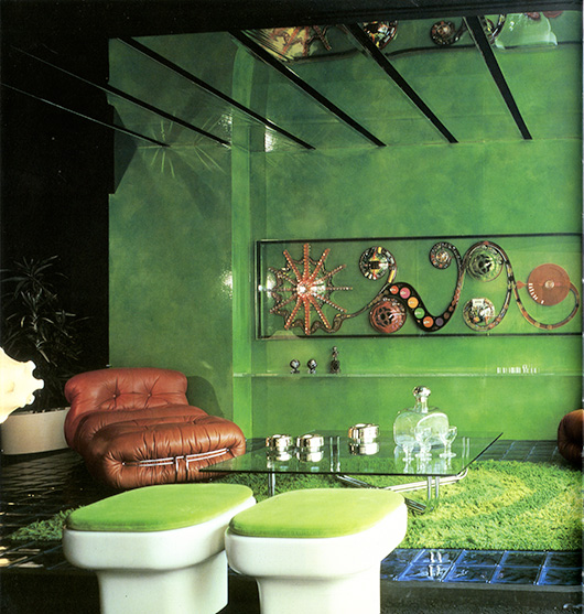
Glazes became her forte. Layers of transparent paint thoughtfully applied to walls.
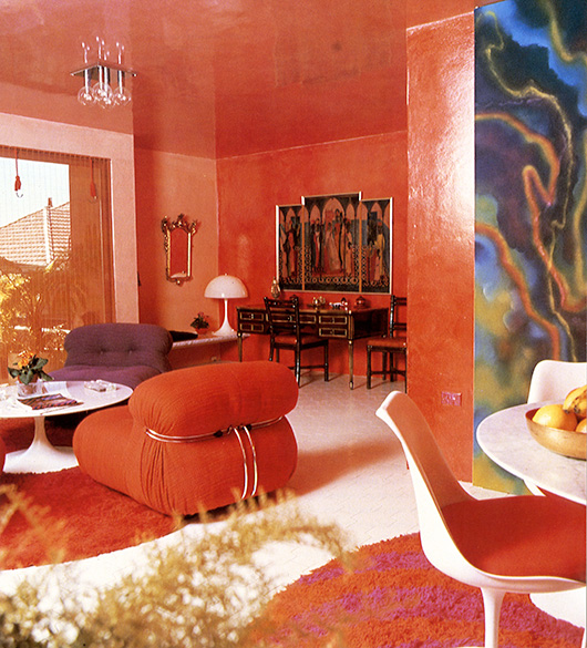
This stunning guest cottage in Castlecrag was designed for clients who were very open to Best's High Style.

She admitted "I just did to architectural finishes what friends who were artists were doing to their paintings". Friends like Justin O’Brien. The undercoat was an equal mixture of flat and enamel house paint, and the contrasting glaze a coat of Dulux gloss stained with translucent artists’ oils.
"It was the glazing technique that made the colours sing with such freedom and varying depth only possible with this new found technique. I was interested in Justin O'Brien's technique in oil painting of overlaying a heavy colour over a singing light one such as olive over a brilliant yellow, then scraping it off to a varying scale of transparency. The same with the reds overlaid over pink or greens or rich yellow, whichever he had in mind, and scraped away to such varying transparency of colour, tone and movement. It was this subtlety that made me realise the importance in glazing technique of the choice in undercoat colour for maximum subtlety or brilliance. There was no end to this beautiful discovery, and the variety and contrast of scale from light to dark is thrilling."
Makes for a thrilling apartment.
"Colours were never thoughtlessly used. If one wants to be spun into orbit on fabulous vibrant colour, with an emerald room off a vermilion room, the effects can be magical if other colours in the right scale and tone appear in paintings or through open doors, or mirrors; but is must be planned, and it must look free and not contrived. Whether high or low tone, the same applies. So too the pattern - they can mix, as Matisse has shown us but it is for the highly trained to do and not a salesman of wallpapers. Never for novelty and only a very high plane of intellectual artistry."
Thoroughly modern Marion.
Julia Ritson is a Melbourne artist. Her paintings investigate colour, abstraction and a long-standing fascination with the grid. Julia has enriched and extended her studio practice with a series of limited edition art scarves. She also produces an online journal dedicated to art and scarves and architecture.
Women from History: Margaret Preston's Rules
By Julia Ritson Magaret Preston was a formidable artist and an inspiring teacher who was interested in everything.
I'm drawn to her domestic scenes from the 1910s. Scenes played out in a modern world within a landscape of war.
A device she used in many of her flower paintings was the table cloth. The cloth enabled the artist to emphasise the shallow space, pushing all to the front of the picture plane. An abstraction.
Red, white, blue and black plaid in this painting. Preston is starting to experiment with the flattening of space. When you see these paintings in the flesh, you get a better idea of her use of empty areas to provide light to the overall design.

Margaret Preston, Holiday still life, 1913
In this painting she uses an indoor/outdoor concept with the cloth playing a large part.
Preston said "why there are so many tables of still life in modern paintings is because they are really laboratory tables on which aesthetic problems can be isolated."

Margaret Preston, Still life sunshine indoors, 1914
The red and white gingham in this painting adds an unpretentious element to the complexity of the picture plane.
A wonderful use of black in the lacquer tray alongside the black border pushes the composition into edgy territory.

Margaret Preston, Still life, 1915
In this painting you get to experience Preston's love of white paint in all its chalkiness.
The pink and white striped cloth is reflected charmingly in the shiny tea pot.

Margaret Preson, Still life with teapot and daisies, 1915
Preston was also a prolific writer. One of her quirkier works was a piece she wrote for The Home in 1926 with instructions for furnishing a bedroom.
Mrs Margaret Preston makes some practical suggestions for arranging a bedroom, keeping in mind that it is the most intimate room in the house.
WALLS Painted in a pale colour, preferably cream or pink.
WOODWORK Light in colour, matt in surface work.
CEILING Plain white, small decorated line separating walls from ceiling.
FLOOR Seagrass mat, not too big, so that it can be taken up each week. Outside borders of boards stained or painted. Grey soft mats for the bedside etc.
MANTEL If made of wood, stained a bright colour to match mats and curtains.
ON THE MANTEL No draperies; a few intimate possessions and a few pet books; coloured line mats. Needlework (samples) framed, or a water colour painting - a gaily coloured print would do. No oil paintings in a bedroom.
CURTAINS Washing material, something with a bright stripe. Keep rather short.
FURNITURE Single beds of wood and cane; two or three chairs, one an easy chair with a slip-on cretonne cover, one with a straight back for the dressing table; a low, wide dressing table - all straight lines except the oval mirror. The woodwork to be of a very highly polished and the dressing table effects glittering silver or glass.
PICTURE Water colours or prints.
ORNAMENTS, LAMPS, ETC No ornaments. No top lights; they make shadows in the mirror.
The world according to Mrs Preston.

Julia Ritson is a Melbourne artist. Her paintings investigate colour, abstraction and a long-standing fascination with the grid. Julia has enriched and extended her studio practice with a series of limited edition art scarves. She also produces an online journal dedicated to art and scarves and architecture.
Women from History: Ebullient Eszter Haraszty
By Julia Ritson When flicking through the mammoth Knoll Textiles' catalogue, published by Yale University Press, Eszter Haraszty's work really stands out for me.
Haraszty studied painting and art history in Budapest but had to leave Hungary due to the German occupation in World War II. Haraszty ended up in New York city living with Marcela and Constance Breuer.
She found work with Hans Knoll. At the time, Knoll was going through a company wide re-focus on the importance of colour. And in the process, Haraszty became Knoll's Chief Colourist.
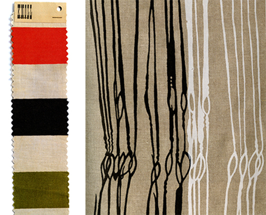
Her ability to re-think colour led to some long lasting classics. The swatch on the left is called Knoll Stripes. Love the combination of the primary red with olive. The company publicity described these colours as "clear sunlight tones... mixed spontaneously with... deep rustic tones of olive, charcoal and rust."
The swatch on the right is inspired by heddles on a loom (the bit that separates the warp from the weft). Beautiful work.
For six years, she played around with many exotic and striking hues. All brilliantly exciting.
Sadly she didn't really get on with Florence Knoll so when Hans Knoll died, Haraszty lost her chief champion in the firm.
So it was off to California where her love of embroidery flourished.
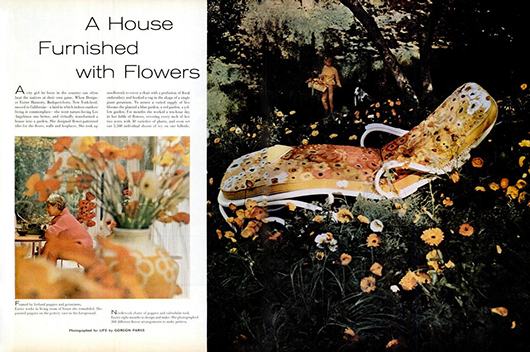
There is a wonderful spread in a 1962 Life magazine featuring the property she patterned.
Flamboyant Eszter.

Dramatic Eszter on her bed with Pancake.
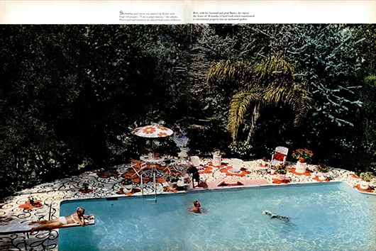
Eszter poolside in her enchanted garden.
She filled the house with flowers that she had grown, designed her own floral tiles, embroidered flowers on all the furnishings, and hung flower paintings.
She was even known to paint poppies on her toenails.
Flower powering her life.
And here is Haraszty in the 1970s holding a copy of one of her books on embroidery.

She made the world more beautiful for all to see.
Julia Ritson is a Melbourne artist. Her paintings investigate colour, abstraction and a long-standing fascination with the grid. Julia has enriched and extended her studio practice with a series of limited edition art scarves. She also produces an online journal dedicated to art and scarves and architecture.
Women from History: Radiant Elizabeth Taylor
By Julia Ritson Elizabeth Taylor was a real dame.
Her penchant for shops in the arcades of swish hotels led to her developing a breathtaking collection of jewellery.
A perfect partner for the history loving Richard Burton. When Burton heard that the La Peregrina pearl was on the market, he just had to have it. He loved the provenance.
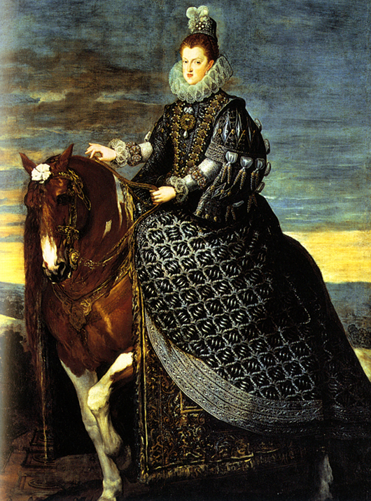
Here is Liz is wearing the very famous La Peregrina pearl, topped up with many other pearls.

The single pearl was found by a slave in 1500 and was passed on around the world, ending up as part of the Spanish royal jewels.
Other famous women have worn this very large pearl. In this wonderful 1634 painting by Diego Velázquez, we see Queen Margarita of Spain wearing the pearl set as a brooch.
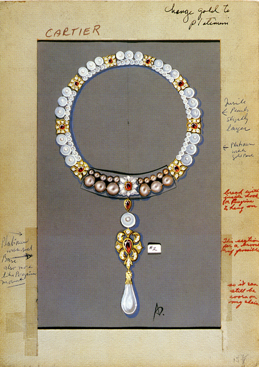
After the purchase in 1969, Burton and Taylor approached Cartier to set the very special pearl in a new way. They were inspired by a portrait of Mary Queens of Scots wearing another pearl necklace and asked Cartier for a similar setting.
This image shows the collaboration between Cartier designer Al Durante and Taylor.
Taylor's life was full of drama.
Here she relates a story about losing the pearl. "At one point I reached down to touch La Peregrina and it wasn't there! I glanced over at Richard and thank God he wasn't looking at me, and I went into the bedroom and threw myself on the bed, buried my head into the pillow and screamed. Very slowly and very carefully, I retraced all my steps. I took my slippers off, took my socks off, and got down on my hands and knees, looking everywhere for the pearl. Nothing. I thought, 'It's got to be in the living room in front of Richard. What am I going to do. He'll kill me! Because he loved the piece!'" Taylor then looked at one of their puppies which seemed to have something in its mouth. "I casually opened the puppy's mouth and inside was the most perfect pearl in the world. It was, thank God, not scratched."
What a dame.
Julia Ritson is a Melbourne artist. Her paintings investigate colour, abstraction and a long-standing fascination with the grid. Julia has enriched and extended her studio practice with a series of limited edition art scarves. She also produces an online journal dedicated to art and scarves and architecture.