
Women in Art: Dealing with the past
By Lauren Treiser For my grand finale post on Women in Art I decided to visit the spectacular Heide Museum of Modern Art. Currently there are two exhibitions featuring the work of Louise Bourgeois (1911 – 2010). The first, Louise Bourgeois: Late Works is direct from the late artist’s studio in New York. The second exhibition, Louise Bourgeois and Australian Artists presents a selection of works by contemporary Australian artists who have been inspired by Bourgeois alongside her prints and drawings. This is the first exhibition in Australia since 1995 when the NGV had a major exhibition of Bourgeois’ works.
 Left: Louise Bourgeois, 2009, Photograph: Alex Van Gelder
Right: Cinq 2007
fabric, stainless steel (61 × 35.6 × 35.6 cm)
Courtesy Cheim & Read and Hauser & Wirth
Photograph: Christopher Burke
© Louise Bourgeois Trust / Licensed by VAGA, New York / Viscopy, Sydney
Left: Louise Bourgeois, 2009, Photograph: Alex Van Gelder
Right: Cinq 2007
fabric, stainless steel (61 × 35.6 × 35.6 cm)
Courtesy Cheim & Read and Hauser & Wirth
Photograph: Christopher Burke
© Louise Bourgeois Trust / Licensed by VAGA, New York / Viscopy, Sydney
Louise Bourgeois: Late Works, in the main gallery, focuses on the final fifteen years of Louise Bourgeois’ career. Prior to my visit I was unaware of Bourgeois’ work but she was an incredibly prolific artist and I feel lucky to now know a little bit about her. She was creating art right to the end of her life and even some of the large scale sculptures were created, with assistance, when she was in her nineties. The show examines the use of fabric in her works, and includes sculptures, suites of fabric drawings, watercolours, embroidered texts and lithographs.
The stories that provided life-long fuel for Bourgeois’ art are well known: her parents’ tapestry workshop in which she learnt how a needle could be a tool with reparative qualities; her father’s public infidelity; her mother’s early death; her constant analysis of self; her belief in art as a potential reconciliation with the past. This all equates to her work being quite dark and disturbing but nevertheless interesting.
One of her written pieces in the show states, ‘Art is a guaranty of sanity.’ Art became her whole life; it helped her deal with her anxiety, betrayal, frustration and disgust for her father. She created art to express emotion. Most pieces in this exhibition use her families old clothes and parts of fabric from her parent’s tapestry workshop. Whilst they hold a lot of meaning for the artist, often the meaning is ambiguous to the viewer.
 Spider 1997
steel, tapestry, wood, glass, fabric, rubber, silver, gold, bone (449.6 × 665.5 × 518.2 cm)
The Easton Foundation, New York, NY
Photograph: John Gollings 2012
© Louise Bourgeois Trust / Licensed by VAGA, New York / Viscopy, Sydney
Spider 1997
steel, tapestry, wood, glass, fabric, rubber, silver, gold, bone (449.6 × 665.5 × 518.2 cm)
The Easton Foundation, New York, NY
Photograph: John Gollings 2012
© Louise Bourgeois Trust / Licensed by VAGA, New York / Viscopy, Sydney
Central to the exhibition is Spider, 1997 one of the Bourgeois’ Cells sculptures which is dominated, enclosed and protected by a ginormous spider – a recurring and powerful motif in the artist’s work. Bourgeois created her spider sculptures in tribute to her mother, saying: 'Like a spider, my mother was a weaver. Spiders are helpful and protective, just like my mother'.
 Couple IV 1997
fabric, leather, stainless steel, plastic (50.8 × 165.1 × 77.5 cm)
Courtesy Cheim & Read and Hauser & Wirth
Photograph: Christopher Burke
© Louise Bourgeois Trust / Licensed by VAGA, New York / Viscopy, Sydney
Couple IV 1997
fabric, leather, stainless steel, plastic (50.8 × 165.1 × 77.5 cm)
Courtesy Cheim & Read and Hauser & Wirth
Photograph: Christopher Burke
© Louise Bourgeois Trust / Licensed by VAGA, New York / Viscopy, Sydney
Another highlight of the exhibition is the haunting Couple IV 1997, depicting a pair of copulating, and decapitated lovers. The embracing figures are portrayed in black, and appear as an encased specimen in the vitrine. Looking in, one gets a sense of Bourgeois’ feelings of being a voyeur whilst growing up.
 Femme Maison (2001)
Picture: Christopher Burke
Femme Maison (2001)
Picture: Christopher Burke
Bourgeois started drawing pictures of half women and half houses in the 1940’s. ‘Femme Maison’ dealt with issues of domesticity and the roles of women. This piece can be read in numerous ways, it could indicating that a house could take over a woman’s life, but also the house couldn't exist without the woman. She kept revisiting this idea of a woman and a house combined in her work. Her other sculptures in the show are far more sinister.
 Untitled 2002
Fabric, steel and wood (35.6 x 38.1 x 15.2 cm)
Courtesy Cheim & Read and Hauser & Wirth
Photograph: Christopher Burke,
© Louise Bourgeois Trust/ Licensed by VAGA, New York / Viscopy, Sydney
Untitled 2002
Fabric, steel and wood (35.6 x 38.1 x 15.2 cm)
Courtesy Cheim & Read and Hauser & Wirth
Photograph: Christopher Burke,
© Louise Bourgeois Trust/ Licensed by VAGA, New York / Viscopy, Sydney
Inspired by surrealism Bourgeois’ small scale sculptures combines dismembered torsos made from material and kitchen utensils. On the one hand the shapes are soft and tender and on the other hand they are quite ominous.
 Knife Figure 2002
fabric, steel, wood (22.2 × 76.2 × 19.1 cm)
Courtesy Cheim & Read and Hauser & Wirth
Photograph: Christopher Burke
© Louise Bourgeois Trust / Licensed by VAGA, New York / Viscopy, Sydney
Knife Figure 2002
fabric, steel, wood (22.2 × 76.2 × 19.1 cm)
Courtesy Cheim & Read and Hauser & Wirth
Photograph: Christopher Burke
© Louise Bourgeois Trust / Licensed by VAGA, New York / Viscopy, Sydney
The pieces in the show deal with the artist’s raw emotion and are imbued with heaviness but nevertheless are incredible. What an amazing and prolific artist she was! There is still plenty of time to see this exhibition and with Café Vue on the grounds, there is no excuse to miss it!
Louise Bourgeois: Late Works 24 November – 11 March 2013 Heide Museum of Modern Art 7 Templestowe Road, Bulleen Tuesday – Sunday 10am – 5pm Closed Mondays
Lauren is graphic designer and founder of patchyrugs.com.au. She loves all things design (see her blog at blog.ilovelollies.net) and is particularly passionate about fine art, interior design and jewellery. Lauren is currently studying Gold & Silversmithing and doing graphic design on a freelance basis.
Women in Art: The uncertainty of art and science
By Lauren Treiser This month’s artist in focus is object maker Catherine Truman. On entering her current exhibition at Gallery Funaki, one could mistake all her pieces as installations and small scale sculptures. Upon closer inspection, it is revealed that some of the work can in fact be worn as brooches.


Truman has exhibited nationally and internationally and is represented in a number of major collections. She is co-founder and current partner of Gray Street Workshop – a collectively run studio and access facility for artists working in the field of contemporary jewellery and object making in Adelaide, South Australia.

Some uncertain facts showcases Truman’s interest in the crossover between art and science. She has worked amongst scientists in research environments for many years and it is apparent where she shows off her maquettes as part of the process, just like a mathematician might show thier workings out to an equation. Truman is interested in what makes sense and what doesn't, in the crossover between natural and manmade environments. In this exhibition I found myself getting very close to the work trying to figure out what was natural and what was manufactured. With the foam objects, for instance, we can understand the crab claw but what is that other part? The artist reconfigures nature and makes her audience question it.

What she uses to formulate her work ends up forming a very big part of what she shows. The colours and textures and the feeling of certain materials blend into the finished work. A lot of the time you can’t really tell what is made of paper, what’s made of clay, or what is painstakingly carved from limewood. I think that the artist doesn’t feel it is important for the audience to know what is natural and what is found but rather to present objects that make you think.

Truman is interested in the human form and is qualified in the Feldenkrais Method of movement education where the aim is to reduce limitations in movement and improve physical function. Her focus on human anatomy and how it is translates through artistic processes has shifted in this exhibition to the anatomical structure of sea creatures. The resulting objects characteristically carved from wood, bone, shell or wax are not exact anatomical replicas but rather evoke a sense of recognition.
Having worked as an artist amongst scientists for years, Truman finds these two areas not so dissimilar. “We both agree that unknowing moves us forward and that there is an inherent level of risk and uncertainty in both. We both create images of the things we see and the more we see, the more we understand we don’t know. The images are a translation – a nuanced approximation.”

So no matter if you are a science or art lover, these objects are sure to appeal to you. I love the fact that you could potentially purchase a grouping and have it in your home as a sculptural piece, and then on a given occasion decide to wear one of the parts. Enjoy viewing this exhibition and the numerous draws full of intriguing jewellery at Gallery Funaki.
All images courtesy Gallery Funaki
Catherine Truman: Some uncertain facts 13 November – 8 December Gallery Funaki 4 Crossley Street, Melbourne Tuesday – Friday 11am – 5pm Saturday 11am – 4pm
Lauren is graphic designer and founder of patchyrugs.com.au. She loves all things design (see her blog at blog.ilovelollies.net) and is particularly passionate about fine art, interior design and jewellery. Lauren is currently studying Gold & Silversmithing and doing graphic design on a freelance basis.
Women in Art: It's all in the detail
By Lauren Treiser It’s hard to believe that artist, Natasha Bieniek, who is an upcoming star in the art world, is so young (even younger than me) and has achieved so much already. Last year, she won the $50,000 Metro Art Award and was placed runner up for the Doug Moran National Portrait Prize. She was also a finalist for the Archibald Portrait Prize in 2012. I attended her opening at Dianne Tanzer Gallery and was even lucky enough to meet the artist.
 Scarlet, 2012
Oil on wood
15 x 20cm
Scarlet, 2012
Oil on wood
15 x 20cm
Born in 1984 in Melbourne, Natasha Bieniek has been painting for ten years. Bieniek started her formal training at the VCA in 2002 where she began to concentrate on figurative painting.
The scale of the paintings are the first thing that caught my eye when walking into the gallery. The miniature portraits force the audience to get up close and personal with the work to study the detail. The size of the paintings are relevant to the way most of us view images today. In contemporary culture so much of what we see is miniaturized on our iPhone and iPad. So Bieniek’s work references both the digital era as well as historical miniature portraits before photography was invented. Historically, miniatures were kept of loved ones around ones neck and close to the heart. In Bieniek’s latest series the protagonists are her friends. By sharing these with us she is letting people in "so they feel as though they're witnessing events through a key hole", she said.
 Magenta, 2012
Oil on wood
15 x 20cm
Magenta, 2012
Oil on wood
15 x 20cm
Bieniek’s series is a departure from previous work which were self portraits. She hangs brightly features her friends in their own spaces. The artist does not direct what her sitters should do and rather photographs them in their natural environment. She then paints with oils using the photos as references. The detail is so small that the prerequisites must be a lot of patience and a very tiny brush! Each piece features a woman lying on, under or partly covered by material. The material is painted so perfectly that the work could almost be mistaken for a photograph.
 Hazel, 2012
Oil on wood
10 x 15cm
Hazel, 2012
Oil on wood
10 x 15cm
Bieniek said that she places as much emphasis on the material and objects around the sitters than the sitters themselves. No one of the subjects has greater importance. To me, the women look a little bit lost or forlorn, but the artist has previously stated that she likes to keep the works open for interpretation.
 Rose, 2011
Oil on wood
15 x 20cm
Rose, 2011
Oil on wood
15 x 20cm
Each work takes an average of one month to complete. The work is so small but in fact has such a big impact that it is really important to see these in real life (and not on the computer or iPhone).
 The Sisters, 2012
Graphite¸ carbon and charcoal on paper
43 x 56cm
The Sisters, 2012
Graphite¸ carbon and charcoal on paper
43 x 56cm
Becc Orszag is also exhibiting at Dianne Tanzer with her first solo exhibition. Her drawings are full of trickery and manipulation. She is evidentially a skilled draughtsman. Her work is full of kooky realism with references to instruction manuals and Russian communist posters all in a strange mix of landscape, portrait and performance.
 The Test Pool, 2012
Graphite and carbon on paper
43 x 56cm
The Test Pool, 2012
Graphite and carbon on paper
43 x 56cm
Both exhibitions' works are full of detail so take your time when viewing them and enjoy!
All images courtesy the Artist and dianne tanzer gallery + projects
Natasha Bieniek: She hangs brightly Becc Orszag Dianne Tanzer Gallery + Projects 20 October - 17 November 108 - 110 Gertrude Street
Lauren is graphic designer and founder of patchyrugs.com.au. She loves all things design (see her blog at blog.ilovelollies.net) and is particularly passionate about fine art, interior design and jewellery. Lauren is currently studying Gold & Silversmithing and doing graphic design on a freelance basis.
Women in Art: Abbey McCulloch as herself
By Lauren Treiser Often found on the 50 most collectable Australian artist list published by The Australian Art Collector, Gold Coast based artist Abbey McCulloch is a star! She is well known for her sublimely coloured female subjects with intriguing eyes and pouting lips, which manage to express feelings of both seduction and vulnerability at the same time.
 The Isolator, 2012
Image from Helen Gory Galerie
The Isolator, 2012
Image from Helen Gory Galerie
Two time Archibald finalist, McCulloch’s current exhibition at Helen Gory Galerie has one major difference to her other bodies of work which explore themes of femininity. And that is for the first time McCulloch has used herself as the subject matter.
 The Wimp, 2012
Image from Helen Gory Galerie
The Wimp, 2012
Image from Helen Gory Galerie
According to the artist, she is ‘quite a shy person and incredibly self conscious.’ This was her initial impetus to start painting and drawing; as a way to divert attention away from herself, so others could focus on something else, like a decoy. Well, it seems that McCulloch has matured since then, managing to make a 360 and in fact turn the attention directly onto herself. This all happened when McCulloch found herself a few weeks away from the deadline of the Doug Moran National Portrait Prize with no subject to paint. Despite years of avoiding painting herself, she found herself with no other option. Eventually, ‘The Wimp,’ which is part of the exhibition at Helen Gory Galerie, was selected as a semi finalist for the prize. I find the name of the work ironic because she is anything but that, having been able to paint herself and enter the piece into such a prestigious prize.
 The Black Iris, 2012
Image from Helen Gory Galerie
The Black Iris, 2012
Image from Helen Gory Galerie
She found that painting herself gave her freedom and a vehicle to express ideas that otherwise she was unable to achieve. She could make the exact works she wanted to make and moved on to produce a series of self portraits. The next piece she created was, ‘The Black Iris’ which shows the duality of McCulloch’s personality. The artist is shown cutting her own hair and her doppelgänger is simultaneously cutting a black iris. One of her moves with nonchalance whilst her doppelgänger seems to be screaming.
 The Intervention, 2012
Image from Helen Gory Galerie
The Intervention, 2012
Image from Helen Gory Galerie
Moving on from these two initial works, the series got lighter and more playful. She is represented in each one with more confidence. The characters that she creates of herself emerge from flat painted ice-cream coloured backgrounds. The pieces come across to me as being quite girly, so I would be interested to know what a male audience’s take on them would be.
With only hints to the narrative, McCulloch puts a lot of clues in the eyes. Her subjects seem both brave and vulnerable at the same time, offering the viewer quite a real version of beauty.
 I can feel myself sinking into the ground, 2012
Image from Helen Gory Galerie
I can feel myself sinking into the ground, 2012
Image from Helen Gory Galerie
The contradictions inherent in McCulloch’s subject matter is mirrored in her medium. Carefully drawn elements alternate with undefined edges, flattened background hues are overlaid with textured areas of colour where the brushstrokes are quite evident. McCulloch’s process is to begin with charcoal onto canvas, building up to washes and then to thicker oils. McCulloch notes that it is always hard deciding when to stop and when to let the painting breathe.
 Good Things Great Things, 2012
Image from Helen Gory Galerie
Good Things Great Things, 2012
Image from Helen Gory Galerie
My favourite piece in the exhibition is ‘Good Things Great Things.’ The ostentatiously dressed girls with their desserts captures a moment in time which is raw and unconstrained.
A few years ago McCulloch was featured on Art Nation which really gives you an insight into her personality and a better understanding of her work.
I was completely enthralled by this exhibition so if anyone wants to buy me one of these beauties as a present, I wont be saying no!
Abbey McCulloch: A New Normal Helen Gory Galerie 25 St Edmonds Rd, Prahran, VIC 12 September – 6 October Wed - Sat 11am-5pm
Lauren is graphic designer and founder of patchyrugs.com.au. She loves all things design (see her blog at blog.ilovelollies.net) and is particularly passionate about fine art, interior design and jewellery. Lauren is currently studying Gold & Silversmithing and doing graphic design on a freelance basis.
Women in Art: Brush and thread
By Lauren Treiser This month, Nellie Castan Gallery in South Yarra has spoiled me for choice on exhibitions by female artists so I decided to share both with you.
 Harem
2012
Image from Nellie Castan Gallery
Harem
2012
Image from Nellie Castan Gallery
Walking into the gallery you are hit by large and energetic abstract works. Artist Camille Hannah’s second solo exhibition ‘Stutter Speed’ has just opened showcasing her beautiful oil and acrylic works.
When one looks at her oversized works, one finds depth in the simple twist of what must be a very large brush. Upon looking up close it seems the paint is trapped between two surfaces. And this is indeed what has happened. Hannah paints on the back of perspex and then mounts this to aluminum. What this means is the viewer is given the rare opportunity to see what normally may be considered the process behind the painting. Although the audience can see the loose brushstrokes so intimately their size makes them feel imposing.
 Caecus macula
2012
Image from Nellie Castan Gallery
Caecus macula
2012
Image from Nellie Castan Gallery
Camille says that she is “interested in the photographic aesthetic that harnesses a unique experience of light, Hannah’s paintings have an ability to suggest movement yet with light’s imperceptible speed, a relationship between painting and digital technology that is one of seduction rather than production.”
 Orexis (between Skins)
2012
Image from Nellie Castan Gallery
Orexis (between Skins)
2012
Image from Nellie Castan Gallery
Camille Hannah is the recipient of an Australian Postgraduate Scholarship Award and is currently undertaking a Masters of Fine Art by research at the Victorian College of the Arts. This year Hannah was a finalist in the 2012 Wynne Prize.
 Lachesis
2012
Image from Nellie Castan Gallery
Lachesis
2012
Image from Nellie Castan Gallery
In the second gallery space, Georgina Cue presents a series of delicate embroideries which upon first glance seem quite innocent. Upon closer inspection their dark side is revealed. Cue has reinterpreted early 20th century police photographs depicting the aftermath of cold-blooded murder and deaths in the grimy streets and gardens of New York. The title of the exhibition alludes to the small clues left in the scenes which point to the nature of the crimes committed.
 Eos
2012
Image from Nellie Castan Gallery
Eos
2012
Image from Nellie Castan Gallery
Indicium investigates how in the absence of the victim’s body, our attention is deferred onto the obsessively captured peripheral detail of the scene. The monochromatic palette that has been used forces the audience to hone in on the detail without being distracted by colour. The forensic image can appear ‘...at once to be utterly mundane and yet charged with a surplus of meaning that eludes our visual inspection and so seems vaguely uncanny’. This effect is not unlike the typical Hitchcock technique where focus is given to mundane objects to heighten the viewers’ wariness.
Just like Hannah in the first gallery space, Cue’s process of thickly weaving the image into fly-screen reveals the makings of the frame. Perhaps she thinks there are enough mysteries in the subject matter itself to hide the makings of the work.
In the centre of the space Cue has created an embroidery which literally jumps out at the audience making it feel like you are part of the scene.
 The Aleph
2012
Image from Nellie Castan Gallery
The Aleph
2012
Image from Nellie Castan Gallery
Georgina Cue completed a Bachelor of Fine Arts at the Victorian College of the Arts in 2011 and next year Cue will undertake an artist residency at the Flux Factory in New York.
Although both the exhibitions are very different, both reveal their process which I really enjoyed seeing for once!
Camille Hannah: Stutter Speed Georgina Cue: Indicum Nellie Castan Gallery Level 1, 12 River Street South Yarra, VIC 23 Aug - 15 Sep 12 Mon: Closed, Tue - Sat: 12:00 pm - 05:00 pm, Sun: Closed
Lauren is graphic designer and founder of patchyrugs.com.au. She loves all things design (see her blog at blog.ilovelollies.net) and is particularly passionate about fine art, interior design and jewellery. Lauren is currently studying Gold & Silversmithing and doing graphic design on a freelance basis.
Women in Art: Sarcophagus
By Lauren Treiser Dead animals have been Julia deVille's medium of choice for many years now. The title of her latest show is Sarcophagus and includes works that communicate the atrocities that go on in the meat, egg and dairy industries. Julia is not a fan, to say the least, of commercial farming methods and can recite in horrific detail the atrocities she says are committed in the name of putting food on our plates. The message she is emphasising in this show is obviously one that she is passionate about even to the point of putting animal activist flyers alongside the room sheet in the gallery. The pieces in the exhibition are both beautiful and confronting.
 It's a wonderful life
2012
Image from Sophie Gannon Gallery
It's a wonderful life
2012
Image from Sophie Gannon Gallery
Entering the gallery I was struck by the stag hanging from the ceiling with rubies falling from its neck into a jar below. It's a wonderful life forms the centrepiece of the exhibition and goes a long way in filling me with both shock and awe. In the introduction to the catalogue, David Walsh, owner of MONA (Museum of Old and New Art) in Tasmania, writes that his display of hanging meat in his gallery was likened to building glass walls for the slaughterhouse. And I believe that this is what Julia is doing with this piece.
 Custard
2012
Image from Sophie Gannon Gallery
Custard
2012
Image from Sophie Gannon Gallery
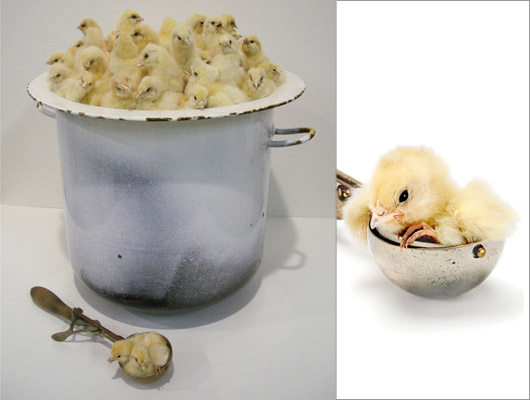
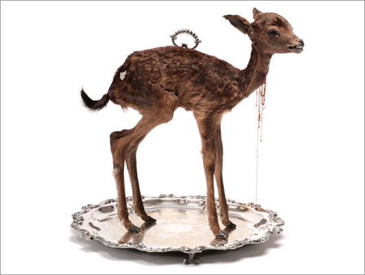
On the one hand some of the animals look cute until you take in their surroundings, sitting in a pot or perched on a silver serving tray. Some animals, like the large deer which is seated directly on the table, has only the recognisable handle of a cloche in its back and bloodied cutlery next to it. Others seem peacefully laid out but upon closer inspection little blood spots which are precious stones appear to be set in their body. The names that Julia has given each piece give the audience an insight into the bad treatment that animals experience at our expense for a delicious meal. For example, the antique ice-cream vat full of chicks is called Custard, and puts into question how sometimes we are not even aware that caged eggs have been used in a dish. So in fact once you consider the artist’s message, the animals no longer look cute at all!
 Majesty
2012
Image from Sophie Gannon Gallery
Majesty
2012
Image from Sophie Gannon Gallery
 Lamington
2012
Image from Sophie Gannon Gallery
Lamington
2012
Image from Sophie Gannon Gallery
The comeback of taxidermy in recent years has slightly altered the general public's perception, making it a more accepted medium. In spite of this the most confronting part of the show for me were the lambs. I am a meat eater and these pieces made me uncomfortable, almost squeamish. They certainly made me think twice about what ingredients I use.
 Sentience
2012
Image from Sophie Gannon Gallery
Sentience
2012
Image from Sophie Gannon Gallery
Being both a passionate vegetarian and a person who feels very strongly about the fair and just treatment of animals, Julia only uses animals that have died of natural causes. This certainly goes a long way in making it easier for her audience to digest her work. She finds dead birds and mice lying around but most of her subjects are donated to her by friends and strangers.
She obviously wants people to really question their eating habits and realize that no matter how something is served up to them, they have to be aware of what has happened to the animal before it reached their table. “A lot of people eat meat but don't want to be confronted with what they're doing,'' she said. ''They're choosing to be ignorant in a way.''
 Mishicanca
2012
Image from Sophie Gannon Gallery
Mishicanca
2012
Image from Sophie Gannon Gallery
Julia deVille is a jeweller and a taxidermist whose work explores life's big questions: mortality, spirituality, nature and history. Julia has exhibited at the NGV, MCA and has pieces in the MONA collection. She has always been fascinated by the aesthetic used to communicate mortality in the Memento Mori period of the fifteenth to eighteenth centuries, as well as the methods the Victorians used to sentimentalise death with adornment.
She works predominately in traditional gold and silversmithing techniques, combined with materials that were once living such as jet, a petrified wood historically used in Victorian mourning jewellery, and of course taxidermy.
Julia describes her own work as “peacefully dark,” and has grouped her arts and commercial practices under the banner Disce Mori (learn to die), indicating her diligent exploration of the visual language of death.
 Gilt
2012
Image from Sophie Gannon Gallery
Gilt
2012
Image from Sophie Gannon Gallery
Although I am not sure if her show will achieve what she has set out for it, which is to change the way people consume animal products, it certainly highlights for the audience the ill-treatment suffered by animals and at least gets them thinking! I am fascinated by each setup in the exhibition and this is definitely a show worth seeing for yourself. The detail and the little messages that Julia has imbued within each piece can only be truly appreciated in person.
 Genocide
2012
Image from Sophie Gannon Gallery
Genocide
2012
Image from Sophie Gannon Gallery
Something that piqued my interest during my research was that to prove her dedication to her art form, Julia has donated her body to Germany’s renowned Institute for Plastination. What this means is that after her death, her body will be dissected, filled with a special polymer and exhibited. She feels that if she can do this to animals it is only fair it should be done to her.
Julia deVille’s jewellery is sold throughout boutiques across the world. To learn more about Julia and her work visit juliadeville.com
Sarcophagus Sophie Gannon 2 Albert Street, Richmond, Melbourne 24 July – 1 Sept Gallery Hours: Tuesday – Saturday, 11am – 5pm
Lauren is graphic designer and founder of patchyrugs.com.au. She loves all things design (see her blog at blog.ilovelollies.net) and is particularly passionate about fine art, interior design and jewellery. Lauren is currently studying Gold & Silversmithing and doing graphic design on a freelance basis.
Women in Art: In a mother's skin
By Lauren Treiser Even though it has been freezing, I decided to venture into the city for some art viewing this month. On my journey I discovered a relatively new gallery tucked away fittingly in a Melbourne basement.
 Kate Just: The Skin of Hope
Daine Singer Gallery
Photograph: John Brash
Kate Just: The Skin of Hope
Daine Singer Gallery
Photograph: John Brash
Kate Just is an American-born Australian artist who is well known for her knitted and mixed media installations. Kate’s knitted works are large and therefore challenge the preconceived notions of knitting as a domestic craft. No granny squares found here! Her work focuses on mythology and history and women’s stories within that. The loveliest part of her installations is that they give the impression that she is knitting her autobiography. Her current exhibition at Daine Singer Gallery in Melbourne’s CBD does just this and hones in on Kate’s experiences with parenthood.
The Skin of Hope is named after Kate adopting her daughter, Hope. Kate and her partner adopted Hope when she was about 2 years old. Sadly she had a rough start in life. Once adopted, Kate found that she was a tough and resilient kid. It sounds to me as if her situation forced her to create her own suit of armor which became the root of the imagery for Kate’s exhibition. Interested in the idea of skin, Kate explores how people imprint and bond with each other at skin level.
 The Armour of Hope 2012
Digital type-C print
Image from Daine Singer
The Armour of Hope 2012
Digital type-C print
Image from Daine Singer
This body of work was created when Kate travelled with her partner and daughter to Barcelona to partake in an Australia Council Residency. Here she created knitted second-skins, armors and photographs of herself and her daughter. The focal piece in the exhibition is The Armour of Hope, a suit of chain mail stitched from metal and silk and threaded together to form a body suit. It is a combination of the softness of skin and the toughness of metal combined, the dichotomy of vulnerability and strength. Although this piece is about Hope (the child) all parents can identify with the idea of wrapping their kids in cotton wool to protect them from the world. The protective layer is permeable though, covered in holes so that as Daine Singer (gallery owner) said, ‘there is room for the love to get in.’
 The Armour of Hope 2012
Hand knitted metal and silk
Photographs: John Brash
The Armour of Hope 2012
Hand knitted metal and silk
Photographs: John Brash
In the nearby photo, The Armour of Hope, Hope wears the suit in the studio in Barcelona. The tiles have a Moorish feel to them transforming her into a crusader of sorts. I think that on the one hand it is a positive image of a young girl showing her strength and resilience, whereas on the other hand perhaps little girls should not have to worry about such things just yet.
 The Armour of Hope 2012
Hand knitted and hand embroidered rayon and cotton
Photograph: John Brash
The Armour of Hope 2012
Hand knitted and hand embroidered rayon and cotton
Photograph: John Brash
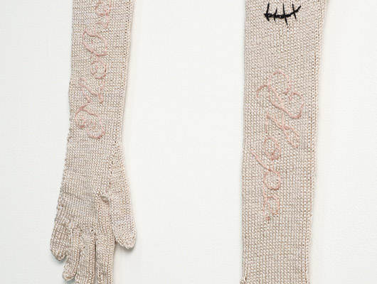
The hand-knitted gloves hanging on the wall with the words Hope and Mother looped into their fabric are called The Arms of Mother. This title highlights the paradox of arms being both limbs and weapons, both comforting and war mongering. This double meaning could be a reference to Hope’s early life experience and thankfully to the protection she now gets from her new parents. The other incongruous thing about these soft gloves is that they have been scarred highlighting the dark side of motherhood.
I can imagine that this exhibition would resonate with mothers who grapple with the balancing act of protecting their children and simultaneously wanting them to learn and experience the world.
 The Skin of Hope 2012
Digital type-C print
Image from Daine Singer
The Skin of Hope 2012
Digital type-C print
Image from Daine Singer
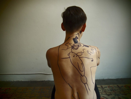
In the photograph above, The Skin of Hope, Kate asked her daughter to draw on her back. Hope has drawn herself within a bubble and the bits around her are meant to be musical notes. The drawing is a happy one but she seems to have also has picked up on elements of the exhibition, like the protective boundaries.
 Tools of Hope 2012
Epoxy resin, wire and velvet
Photograph: John Brash
Tools of Hope 2012
Epoxy resin, wire and velvet
Photograph: John Brash
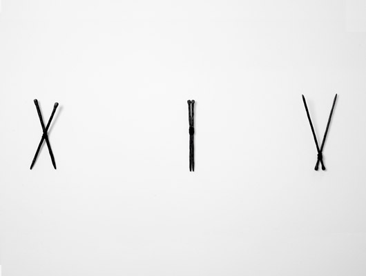
She has also brought prominence to her tools in her work by casting them in resin and presenting them as a piece in their own right. Tools of Hope are more than just knitting needles but the language she uses to tell her story.
The exhibition at Daine Singer coincides with a survey exhibition of Kate’s major knitted works at Ararat Regional Art Gallery entitled Kate Just: The Knitted Work 2004 – 2011. Included in this mini retrospective are Kate’s text-based sculptures and abstracted installations. The exhibition provides a context in which to present the gallery’s latest acquisition of Kate’s major sculpture, Paradise (2006).
 Paradise
Mixed media
Image from Daine Singer
Paradise
Mixed media
Image from Daine Singer
Kate describes Paradise in the following way: ‘At first glance, this is modern day suburbia, safely sealed, without a hint of the wild, until we see that she is sinking into an earthen, muddy crack that has split through the grass. She has dropped her long, snaking garden hose and her eyes are closed in surrender... The work references both Eve, and Greek goddess Persephone, evoking rich associations of 'the feminine' in nature. Persephone’s is one of many stories that tell of goddesses’ descent into the underworld, literally under the surface of the ground, and symbolically this refers to a woman’s journey into the dark and unknown regions of the self’.
 Boundary (Love) (2004)
Mixed media
Image from Daine Singer
Boundary (Love) (2004)
Mixed media
Image from Daine Singer
Other pieces in the exhibition include The Garden of Interior Delights (2008), on loan from the collection of the City of Port Phillip, and Boundary (LOVE) (2004).
It was great discovering a new artist and gallery. To learn more about Kate and her work visit katejustart.blogspot.com.au
The Skin of Hope Daine Singer Basement, 325 Flinders Lane, Melbourne 24 May - 30 June 2012 Gallery Hours: Wed - Saturday, 12-5pm
Kate Just: Knitted Works 2004 – 2011 Ararat Regional Gallery 17 May - 8 July 2012
Lauren is graphic designer and founder of patchyrugs.com.au. She loves all things design (see her blog at blog.ilovelollies.net) and is particularly passionate about fine art, interior design and jewellery. Lauren is currently studying Gold & Silversmithing and doing graphic design on a freelance basis.